The Role of Colour Psychology in Branding
Don't just pick a colour because you like it. Choose colours that align with your brand's personality and values.
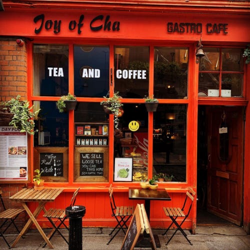
Last week, I was strolling through Dublin's grey streets, when a little café tucked between two dreary office buildings caught my eye.
Its bold red colour stood out like a beacon, instantly grabbing my attention and drawing me in.
This moment got me thinking about the power of colour in branding.
It's a silent salesperson, whispering to our subconscious, influencing our emotions, decisions, and perceptions long before logic kicks in.
This week:
The Science of Colour Psychology
How Colours Influence Feelings
The Power of Subtlety
The Paradox of Overstimulation
The Impact of Colour Combinations
Lessons from Iconic Brands
Colour and Culture for Global Branding
The ROI of Colour
My Final Thoughts
The Rabbit Hole
The Science of Colour Psychology
Colours aren't just pretty—they're powerful psychological triggers that can make or break your brand. The latest neuroscientific research explains how colours affect our brains:
The Emotional Brain: Recent fMRI studies show that colours activate the amygdala, the brain's emotional center, within 100 milliseconds of viewing.
Hormonal Impact: Exposure to certain colours can influence hormone production. For example, blue light suppresses melatonin, affecting sleep patterns.
Memory and Colour: People recall colour-coded information 50-80% more accurately than black and white data.
How Colours Influence Feelings
Research has shown that colours can significantly influence our emotions and behaviors.
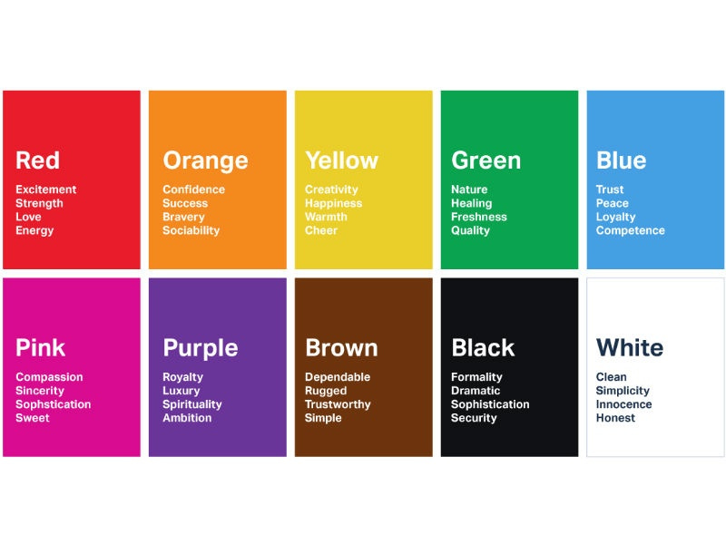
Red: Increases heart rate and stimulates appetite. Great for food brands, but use it sparingly to avoid overstimulation.
Blue: Builds trust and reliability. Ideal for financial or tech companies, but be aware it can sometimes feel cold.
Yellow: Grabs attention and boosts optimism. Perfect for cheerful brands, but too much can be visually tiring.
Green: Promotes tranquility and health. Excellent for wellness or eco-friendly brands.
Black: Conveys sophistication and luxury. Use it to add a premium feel to your brand.
The Power of Subtlety
While bold colours are often highlighted for their attention-grabbing properties, subtlety in colour can also have a powerful impact, especially in high-end and professional branding. Less saturated or neutral colours can convey sophistication and understated elegance.
Apple's use of minimalist colour palettes in its branding and product design suggests simplicity, elegance, and technological sophistication. This approach contrasts with the more vibrant strategies of other tech companies and appeals to a target market that values understated luxury.
The Paradox of Overstimulation
High-energy colours like red and yellow can become overwhelming if overused, leading to negative consumer reactions.
A fast-food chain might benefit from red and yellow in its logo to stimulate appetite, but an overly bright and colourful interior might make customers feel uncomfortable, leading to shorter visits and less satisfaction. This is why some modern fast-food chains are adopting more muted interior designs.
The Impact of Colour Combinations
The interplay between colours can significantly impact brand perception.
The combination of blue and orange in the branding of Fanta creates a playful and energetic vibe that neither colour could achieve alone. This combination leverages the calming effect of blue with the vibrancy of orange to create a balanced yet dynamic brand image.
The Role of Trend Cycles
What works today might not work tomorrow, making it crucial for brands to stay adaptable.
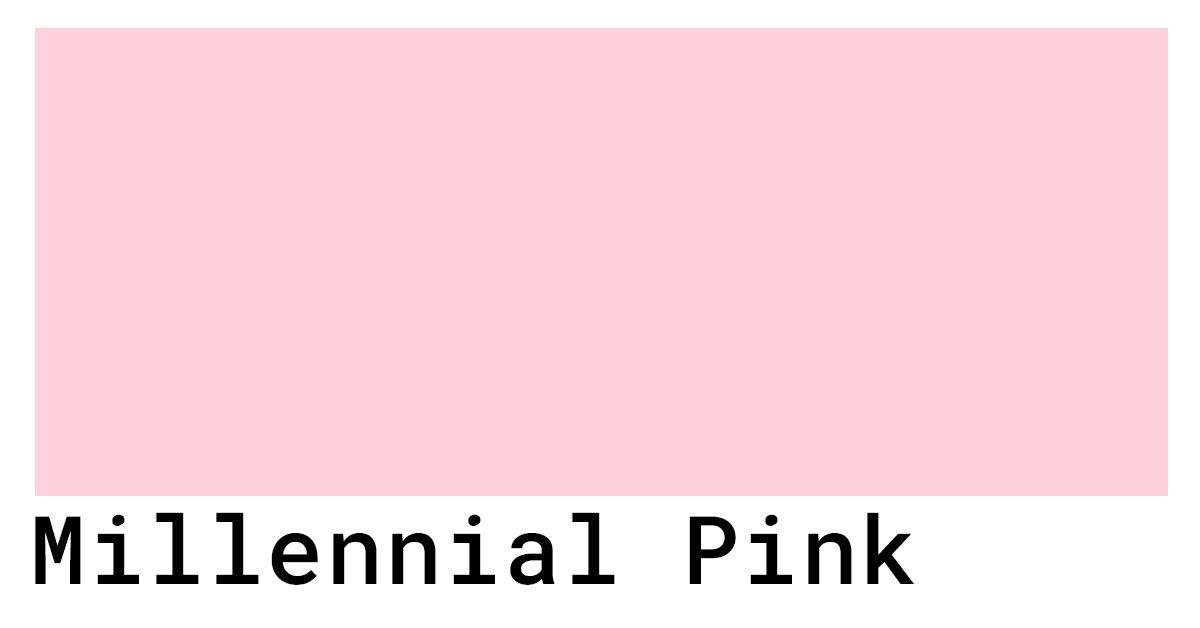
Millennial Pink became a hugely popular colour in branding and fashion a few years ago, symbolising modernity and youthfulness. However, as trends evolve, overuse can make a colour feel dated or clichéd. Brands need to keep an eye on these trends to remain relevant.
Lessons from Iconic Brands
Coca-Cola: Their signature red is more than just a colour; it's a symbol of Americana, happiness, and refreshment. However, the balance of white in their logo prevents the red from feeling overwhelming.
Tiffany & Co.: Their trademarked "Tiffany Blue" is synonymous with luxury, elegance, and timeless style, showcasing how a single colour can become a brand's identity.
Google: Google's use of multiple colours in its logo represents diversity and creativity. It’s playful and innovative, reflecting the brand's approach to its myriad of services. The combination of blue, red, yellow, and green creates a dynamic and friendly feel.
Ferrari: Their racing red screams speed, power, and passion. The use of black and yellow accents adds to the luxury and exclusivity of the brand.
McDonald's: The golden arches are instantly recognisable, evoking feelings of familiarity, comfort, and nostalgia. The combination of red and yellow is particularly effective in stimulating appetite and energy.
Colour and Culture for Global Branding
As your brand expands globally, remember that colour isn't a universal language. Cultural interpretations can vary wildly.
White signifies purity in the West but mourning in parts of Asia.
Green can be taboo in some Chinese contexts.
Red symbolises good luck in China but danger in other cultures.
Take these examples:
When Pepsi launched in Southeast Asia, they initially used light blue for their vending machines. This backfired, as the colour was associated with mourning in the region, leading to a drop in sales. Pepsi quickly switched to a darker blue to better align with local customs.
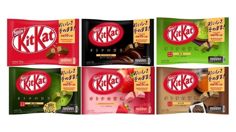
Nestlé's KitKat brand in Japan uses a variety of colours for different seasons and festivals. Cherry blossom pink is used for spring, symbolising renewal and beauty, while gold is used for New Year celebrations, signifying prosperity and good fortune.
Coca-Cola, on the other hand, has successfully leveraged the colour red in China, where it symbolises good luck, happiness, and celebration. This strategic use of red has helped Coca-Cola become a symbol of joy during major holidays like the Lunar New Year.
These examples highlight the importance of understanding and respecting cultural differences when developing global branding strategies. By aligning colour choices with local values and traditions, brands can build stronger connections with their target audiences and avoid potential pitfalls.
The ROI of Colour
Colour isn't just about aesthetics – it's about your bottom line. Research shows that using the right colours can increase brand recognition by up to 80%. This translates to:
Higher Brand Recall: Using distinct and appropriate colours helps customers remember your brand more easily. When your brand stands out in their memory, they are more likely to choose your products or services over competitors.
Increased Customer Loyalty: Consistent use of specific colours can create an emotional connection with your customers. When customers associate positive feelings with your brand's colours, they are more likely to remain loyal and continue choosing your brand.
Improved Conversion Rates: Colours can influence purchasing decisions. By strategically using colours in your marketing and product design, you can guide customer behavior and increase the likelihood of conversions, whether it's making a purchase, signing up for a service, or other desired actions.
My Final Thoughts
My stroll through Dublin’s streets wasn’t just a reminder of the city’s charm; it was a vivid illustration of how deeply colours affect us.
Distinctive Brand Assets are the visual and auditory cues that make your brand recognisable even if someone took a blowtorch to your logo. And colour, my friends, is the heavyweight champion in this arena.
In the attention economy, colour isn't just part of your brand - it is your brand.
Audit your brand's colour strategy. Now.
If you're not intentionally using colour to manipulate emotions, drive actions, and pad your bottom line, you're not just leaving money on the table - you're leaving it on the floor, in the parking lot, and probably in your competitor's pocket.
Choose wisely, and let your brand's colours do the talking.
The Rabbit Hole - For Those Who Want to Go Deeper
Check out these hand-picked resources:
Video: Marketing Colour Psychology: What Do Colours Mean and How Do They Affect Consumers?
Good Reads:
Colour Psychology: How To Use it in Marketing and Branding - This is a great deep dive by Hubspot.
Colour Psychology: How Do Colours Affect Mood & Emotions? - this blog will enhance your understanding of how colours impact emotions and decision-making, enabling you to use colour psychology to effectively influence perceptions in both personal and professional settings
Pepsi dies in more ways than one - A deeper look at how Pepsi decided to change the colour of their vending machines from a royal blue to ice blue, which was not received well in the South East Asian countries that Pepsi tried to appeal to.
Good Book:
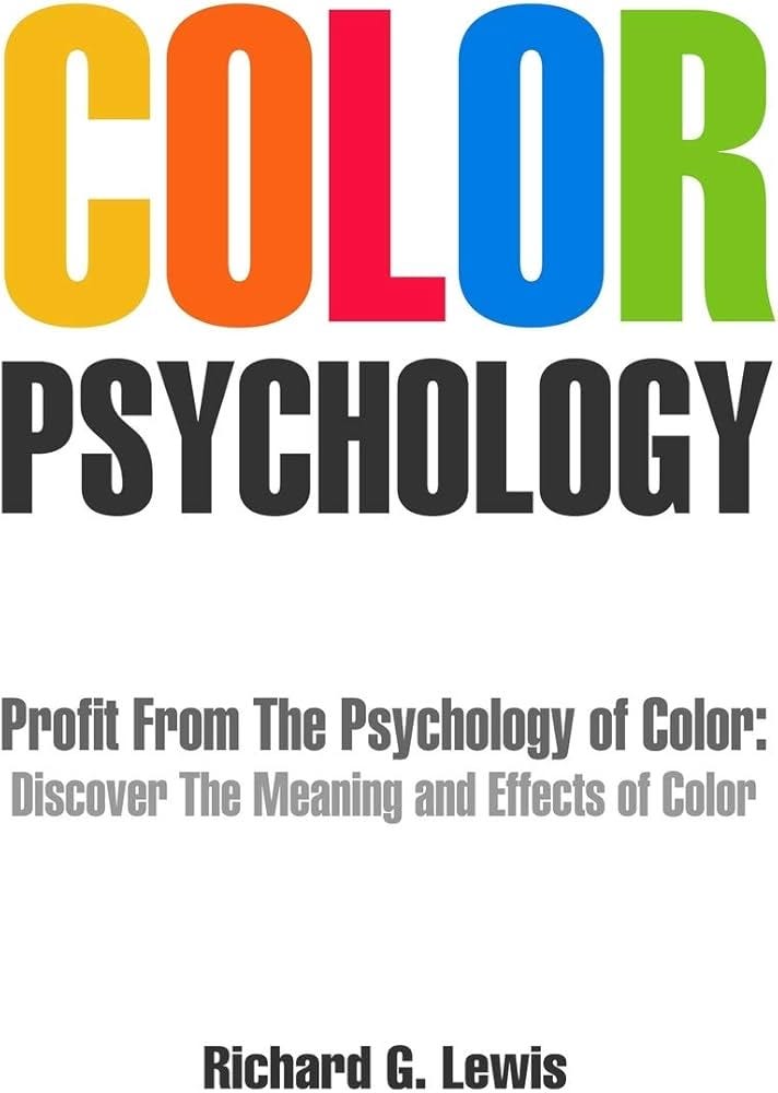
Colour Psychology: Profit From The Psychology of Colour: Discover the Meaning and Effects of Colour by Richard G. Lewis - The book explains the different psychological effects that different colours have on the human mind.





![100+] Tiffany Blue Wallpapers | Wallpapers.com 100+] Tiffany Blue Wallpapers | Wallpapers.com](https://substackcdn.com/image/fetch/w_1456,c_limit,f_auto,q_auto:good,fl_progressive:steep/https%3A%2F%2Fsubstack-post-media.s3.amazonaws.com%2Fpublic%2Fimages%2F372c62b0-969f-4414-b901-9b5d69a148e0_1920x1080.jpeg)
Is great
Is great